Friday, May 15, 2015
Sunday, January 11, 2015
What Have You Learned From Audience Feedback?
Transcript:
The point of audience feedback is to help you get a better understanding of what it is that will draw a potential customer to your product. My audience for punk rock in particular seemed to be young adults due to the fact that original 70s punks had either died out or became the sorts to wear argyle sweaters and wash their cars every Saturday. I also found that the audience was not predominantly male, but rather, 60/40. Therefore I had to tailor my products to both men and women, which is why genderless puppets were used as the singers as opposed to a person who may not identify with certain social groups. Viewers were then free to apply their own meaning and significance onto an inanimate object regardless of gender, age, race or social class. Not knowing or caring who your audience are/have to say would be like painting a picture of spaghetti for an alien with a stick of broccoli - in a manner of speaking.
The bad thing about making my products appeal to a wider audience is that I had to condense and deconstruct a lot of the fake-band’s fake-integrity. In the end, they became little more than a concept/virtual band like Hatsune Miku or The Gorillaz. I found that doing this also stints your creativity. It also took away from the clear-cutness of how I expected a punk rock band to look.
Colours, characters and comedy appealed to my target audience, as well as quite a few others that I interviewed and had no interest in Punk. So, in order to appeal to a broader range of people, I applied these findings into Macro Friends. The puppets and the band’s antics are the comedy, as well as their character. Each mask represents a different band member and help to make the music video semi-narrative. As for the web site, I drew influence from Korn’s as well as a popular indie band Chet Faker—each had simple artwork, which tied in with their upcoming albums.
My field research took place outside a Black Veil Brides concert queue, but some of the footage was destroyed in a beer-spillage. However, some audience could be salvaged. Also, I did some research at school in the sitting area after school with people waiting to be interviewed by their tutors. This passed the time and also helped me get a sense of my peer’s attitudes to the rock genre – and how I may tailor my product to appeal to them. A great majority expressed a disliking or had very little knowledge about Punk. Thus, I had to alter my genre to punk rock (popular with males) crossed with pop-punk (popular with females).
In short, I found that I had to strip away a great deal of Punk’s integral features in order to sell Macro Friends as a product as opposed to them being talented, actual proper artists. I got rid of grungey outfits, mohawks and newspaper-hostage fonts and instead used skin textures and minimalism (black and white) which is commonly seen with techno artists such as MassiveAttack and Nine Inch Nails. I was also influenced by a the photographer Patrick Burdenz, who took picture inside a mortuary--by referencing him, I've referenced and redeveloped the idea of 'decay' and 'anarchy': A common feature in the punk genre.
In summation, audience feedback taught me that sticking to genre is not always a good thing, that time and effort can stop viewer's faces looking so sour whilst viewing my music video and to always accept constructive criticism whilst created a product for them; for money as well if I truly [and unfortunately] did work in the music industry.
Friday, January 9, 2015
In What Ways Does Your Main Product Use, Develop Or Challenge Forms And Conventions Of Real Media Products?
( If the embed code is not working, click here to see my reply to the answer )

I HAVE USED
Black and yellow colour schemes, as seen on the Never Mind the Bollocks album by the Sex Pistols for my website, CD and part of my music video where lyrics flash onscreen.

I HAVE DEVELOPED
I have developed the 'Mask' aesthetic of My Chemcial Romance's Na Na Na video via merchandise on my wedsite representing three masks, which is a reference to the personnas of the band members who cover their faces with paper mache masks in the music video.

I HAVE CHALLENGED the conventions of a punk video by introducing puppet characters as opposed to actual artists. The background for the shed filming was also more similar to Die Antwoord as opposed to Joy Divison or Dead Kennedys
How effective is the combination of your main product and ancillary texts?
( if the embed isn't working, click here to watch the presentation )
Thursday, January 8, 2015
Evaluation: How Did You Use New Media Technologies In The Construction And Research, Planning & Evaluation Stages
(click here to read the answer)
CONSTRUCTION
 Although not part of the New Media, Adobe Premier Pro was very useful in the construction of my final piece due to the fact that it allowed me to make creative decisions that aren’t available on other means of digital editing such as with linear software (Windows Movie Maker) – and as such, influenced my final project which would be distributed onto platforms such as youtube, blogger and facebook. I found that that the ability to add multiple layers onto the project helped me organise the clips. For example, after putting the music onto my project, I could then match up the lip syncing of my clips – and do so on multiple layers. After that, I was able to cut out dodgier parts of each clip such as the characters switching places or forgetting to lip sync. After that, I was able to select the clips I wanted and cut out the ones I didn’t need without having to worry about lip syncing (although using puppets helped in this area, as all they did was move their mouths up and down; thus more usable footage was at my disposal).

In retrospect, Premier pro had a variety of editing options such as changing the colour of the clip and sharpening it, but I didn’t use the technology to its full potential due to the fact that I did not know how to properly colour grade images without the help of tutorials during my AS film opening remake. However I learned a lot about Adobe After Effects after watching a tutorial about creating an RGB Split/Glitch effect. The software was hard to comprehend and it required me to keep referring back to the youtube tutorial, but I used it create the ending sting of the band logo. It was actually one of the very few parts of the music video that I was proud of. Youtube was therefore and essential tool from the New Media range now at our disposal through the internet – as the site’s premier pro and after effects tutorials taught me how to add exponential fades into my project (and example can be seen near the very end) and ghosting, which meant that one clip could be seen overlain through the other; vaguely similar to the True Detective opening credit that I looked at during my research stages. Early on during the creation of my digipak, I tried to use Photoshop in order to create each panel but learned very early on that I wasn’t experienced enough with the programme to create something good.

Therefore, I used GIMP and sites online called ONLINE IMAGE EDITOR and BAR CODE GENERATOR in order to overlay images when my computer was in for repair (online image editor) and make realistic packaging for the back panel of my digipak (The bar code). The parental advisory warning sticker was something I found on the image hosting website called Flickr, a very useful new media technology. However, the inability to save images from the site prove annoying, I had to screencap the stick so as to put it onto the product.

For the creation of my website, I used Wix due to the fact that it was user friendly and I was able to go back to my work to edit before I published – whenever I so desired. Initially, I drew inspiration from other band websites (Korn, Chet Faker, The Sex Pistols) and tumblr HTML layouts available on http://theme-hunter.tumblr.com/. Chet Faker’s minimalist design, Korn’s album cover background and The Sex Pistol’s bold fonts in turn inspired my final website, and thus the usefulness of the Google search engine is evident because without a browser, look for website inspiration would have been impossible.
 Wix was also very comprehensive and allowed me to make achievable decisions over the look of my final site; the option to edit picture using wix software before adding them onto the site (Namely, the black and white images of band members) was also a useful tool which help me accomplish the overall look of the blog (which was the overall look of the album and music video as well as).
The big three were used during the research process. Well, my big three. Tumblr, youtube and Vimeo. I used vimeo to look up the music videos for Royal Blood’s figure it out music video. The video hosting website catered more to independent film makers and as such displayed music videos in widescreen and gave the option to open the video in a popup window. However, youtube gave the option to adjust the resolution of videos whilst researching my selected genre (punk) and most ‘related videos’ were immediately at my disposal down the side of the page for a music video. This made researching my genre quicker to accomplish as opposed to in the past where one could only watch music videos on television channels such as MTV and Kerrang!
 Tumblr was a great help during the research process due to the search options. If I typed in a key word such as ‘punk’ or ‘grunge’ it wouldn’t just search for music videos, but also fashion blogs, fan-made graphics for tumblr user’s favourite bands and fashion as well as overall opinions of the genre from my intended audiences: young adults.
PLANNING
During the planning stages, I used Amazon to buy paint for the construction, papers masks, and a miniature drum kit. The latter didn’t make it into the re-shot as I eventually lost interest in the project due to personal issues (sorry!) but the immediacy of ordering products online was very using during the process of constructing my music video.

EVALUATION
For the evaluation, I used new media sites such as blogger to show you said evaluation (through either words or hyperlinks) and prezi, which made my answer to how effective the combination of my ancillary and main product was more comprehensible. Again, I like how simple the website is to use. Slideshare win again in user-friendliness, as being able to upload powerpoints from your computer to online was really useful in sharing my progress. However, it could take quite a while to load and the embed codes were temperamental when I hadn’t updated my flash. That goes for prezi, too. Although new media programmes were useful in the planning, construction and evaluation of my media product, technology can be unreliable and sometimes I found that doing things on paper before beginning the editing/research better helped me put my thoughts in order.
CONSTRUCTION


In retrospect, Premier pro had a variety of editing options such as changing the colour of the clip and sharpening it, but I didn’t use the technology to its full potential due to the fact that I did not know how to properly colour grade images without the help of tutorials during my AS film opening remake. However I learned a lot about Adobe After Effects after watching a tutorial about creating an RGB Split/Glitch effect. The software was hard to comprehend and it required me to keep referring back to the youtube tutorial, but I used it create the ending sting of the band logo. It was actually one of the very few parts of the music video that I was proud of. Youtube was therefore and essential tool from the New Media range now at our disposal through the internet – as the site’s premier pro and after effects tutorials taught me how to add exponential fades into my project (and example can be seen near the very end) and ghosting, which meant that one clip could be seen overlain through the other; vaguely similar to the True Detective opening credit that I looked at during my research stages. Early on during the creation of my digipak, I tried to use Photoshop in order to create each panel but learned very early on that I wasn’t experienced enough with the programme to create something good.

Therefore, I used GIMP and sites online called ONLINE IMAGE EDITOR and BAR CODE GENERATOR in order to overlay images when my computer was in for repair (online image editor) and make realistic packaging for the back panel of my digipak (The bar code). The parental advisory warning sticker was something I found on the image hosting website called Flickr, a very useful new media technology. However, the inability to save images from the site prove annoying, I had to screencap the stick so as to put it onto the product.

For the creation of my website, I used Wix due to the fact that it was user friendly and I was able to go back to my work to edit before I published – whenever I so desired. Initially, I drew inspiration from other band websites (Korn, Chet Faker, The Sex Pistols) and tumblr HTML layouts available on http://theme-hunter.tumblr.com/. Chet Faker’s minimalist design, Korn’s album cover background and The Sex Pistol’s bold fonts in turn inspired my final website, and thus the usefulness of the Google search engine is evident because without a browser, look for website inspiration would have been impossible.

The big three were used during the research process. Well, my big three. Tumblr, youtube and Vimeo. I used vimeo to look up the music videos for Royal Blood’s figure it out music video. The video hosting website catered more to independent film makers and as such displayed music videos in widescreen and gave the option to open the video in a popup window. However, youtube gave the option to adjust the resolution of videos whilst researching my selected genre (punk) and most ‘related videos’ were immediately at my disposal down the side of the page for a music video. This made researching my genre quicker to accomplish as opposed to in the past where one could only watch music videos on television channels such as MTV and Kerrang!

PLANNING
During the planning stages, I used Amazon to buy paint for the construction, papers masks, and a miniature drum kit. The latter didn’t make it into the re-shot as I eventually lost interest in the project due to personal issues (sorry!) but the immediacy of ordering products online was very using during the process of constructing my music video.

EVALUATION
For the evaluation, I used new media sites such as blogger to show you said evaluation (through either words or hyperlinks) and prezi, which made my answer to how effective the combination of my ancillary and main product was more comprehensible. Again, I like how simple the website is to use. Slideshare win again in user-friendliness, as being able to upload powerpoints from your computer to online was really useful in sharing my progress. However, it could take quite a while to load and the embed codes were temperamental when I hadn’t updated my flash. That goes for prezi, too. Although new media programmes were useful in the planning, construction and evaluation of my media product, technology can be unreliable and sometimes I found that doing things on paper before beginning the editing/research better helped me put my thoughts in order.
Friday, January 2, 2015


Thursday, December 11, 2014
MACRO FRIENDS
NON ADDITIVE DESOLVE
BLACK AND WHITE

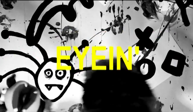
YELLOW ARIAL FONT CAPS


I used the non-additive dissolve near the opening sequence in order to give the illusion that the band/actors are jumping out of one another. A similar effect is also used in the System of the Down video Chop Suey, as well as Around the World by Red Hot Chilli Peppers, who also tie into the rock genre which Macro Friends sits itself in.


BLACK AND WHITE
I changed the video to black and white so that there was some synergy with the digipak as well as the website. I wanted the album titles 'monochrome' to more like a mantra than a product: but the purpose of grey scaling the image is to do just that. To sell the product. I was also influenced by Die Antwoord's I Fink U Freeky music video.
YELLOW ARIAL FONT CAPS
Yellow against a black background is commonly known to be a high-impact colour scheme. Therefore, in order to have amore dramatic effect I overlayed lyrics on top of the clips to draw attention away from some of the messier camera cuts, and to also entertain the audience. They learn the lyrics as well as the get a taste of what the band is about. I got this idea from My Chemical Romance's lyric video of Na Na Na.
Subscribe to:
Posts (Atom)